

Mirror
Rebranding and designing Mirror’s e-commerce clothing website and online experience.
My Role
End-to-end designer from research to branding to testing and iterations
Project Timeline
4 weeks
~40 hours
Tools
Figma, Figjam, Adobe Illustrator, Adobe Photoshop, Google Docs, Google Sheets
Platform
Responsive Website (Desktop to Mobile) / Personal Academic Project

INTRODUCTION
Mirror began in 1994 and has been very successful offline. They have over 400 stores across 32 countries.
Their target audience consists of women and men of all ages, who are looking for fashionable clothing at affordable prices.
Their mission is to make clothing accessible to everyone.
Discovery 👚
DEFINING THE PROBLEM
Mirror does not have an online digital presence
Need a way for new and existing customers to have a positive online experience when navigating and browsing the website as they do with shopping in person.
Mirror has an outdated logo
RESEARCH GOALS
• Find what users value in an online shopping experience
• Design and build a successful website and mobile app that will:
• Retain existing customers and
• Attract new customers
RESEARCH OBJECTIVES
• Why and when do users shop online vs in-store?
• How do Mirror users shop and decide what to buy?
• What are the pain points for users when shopping in-person?
• What steps do users take when finding an item online?
PROJECT GOALS

Diagramming Mirror’s business goals, user goals, and technical restrictions or considerations for me to outline and keep in mind when designing.
COMPETITIVE ANALYSIS

Key Takeaways of Competitors
Pros:
• Sells clothes for the whole family
• Highlights sales and promotions
• Size assistance guide
• Available/pickup in store option
Cons:
• Busy website/too many popups
• Too many clicks when checking out
• Too many filter options
• Too much information on product page
User Research 🔎
USER INTERVIEW QUESTIONS
Questions I asked participants who frequently shop both in-person and online:
What is your favorite website to shop at, and tell me what you enjoy about it?
What website has your favorite shopping experience?
What stores do you shop at the most for clothes?
On a scale from 1-10, how much do you enjoy shopping online? In-person? Why?
Can you walk me through the last time you shopped online?
Where did you shop, and what did you end up purchasing?
What made you decide to purchase that/those item(s)?
Tell me about the last time you got frustrated when shopping online. Tell me about what the perfect online shopping experience looks like?
USER PERSONAS
From my discovery and research phase, I developed a persona that accurately portrays the typical Mirror user.
User: Katie

Her goal: To easily browse, search, and purchase clothing online.
CARD SORTING EXERCISE
I asked 5 participants to organize a list of clothing items in a way that made the most sense to them.

Key Takeaways:
• Some items participants struggled on: Overalls, Shirt Jacket, Cardigan, Bathing suit, Bra, Pajamas, Joggers and Leggings
• “Should i separate the outwear items more?” “Should I separate the shirts more?” “Should socks be under accessories?”
• Participants felt unsure/hesitant about creating a category if there was only 1 item
• Participants mentioned that if a category began to feel like it was getting too large, they considered creating a new category or a subcategory
• A couple participants said that they felt influenced by previous online shopping experiences when organizing and creating their categories
Information Architecture 👕
SITE MAP
I utilized the insights gained from the Card Sorting exercise to create the initial version of Mirror's site map.

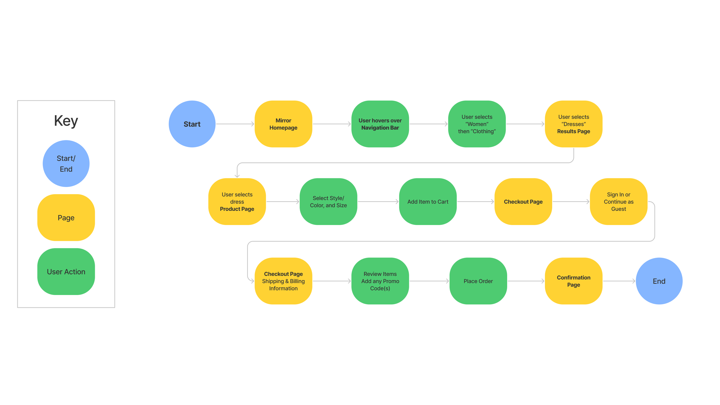
TASK FLOW
After, I delved in deeper to map out what a specific task of placing an order would like for a user.
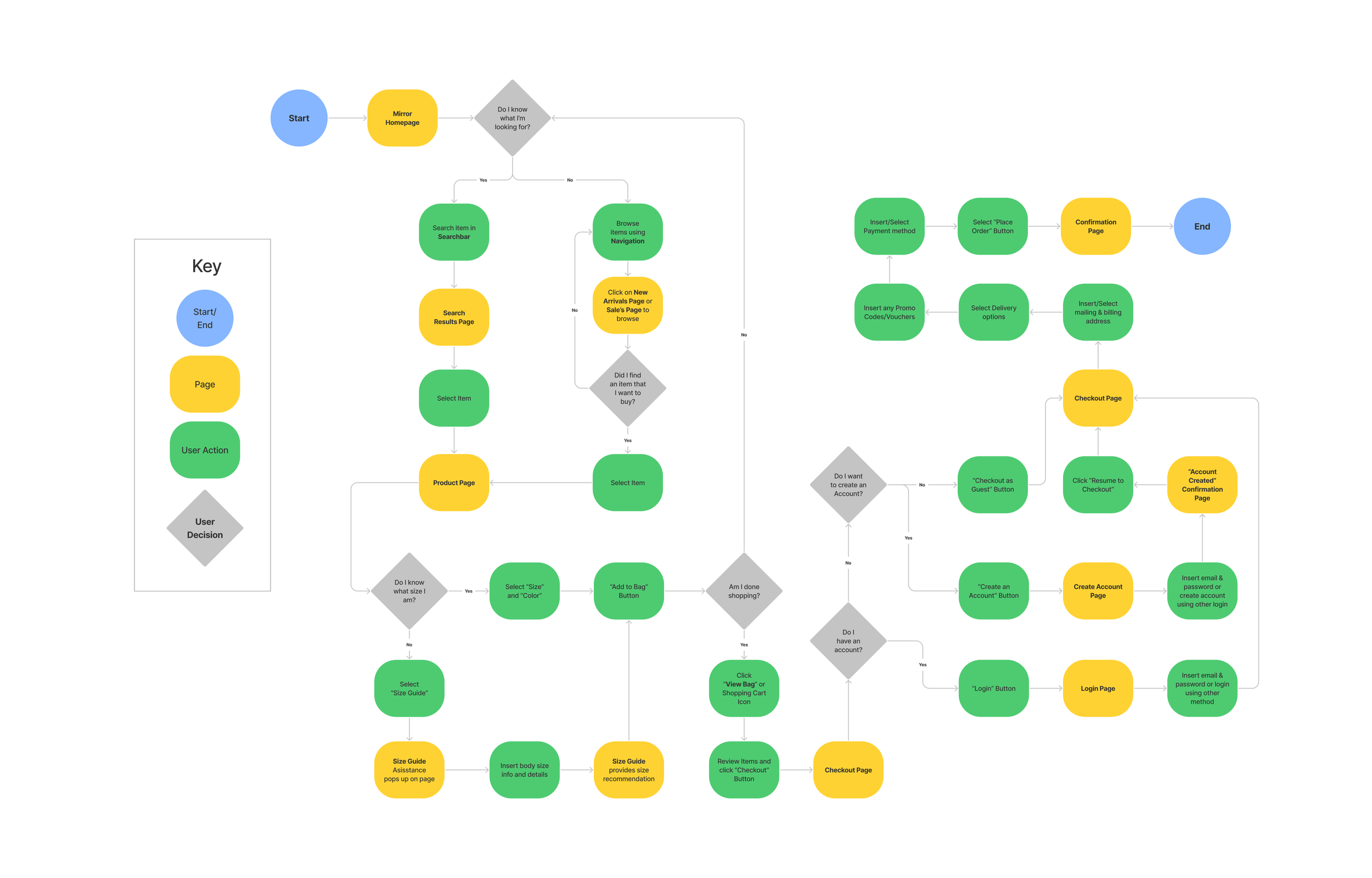
USER FLOW
I also wanted to create a comprehensive map of all the possible user interactions on the Mirror website (which includes the task flow from above).
Design 🎨
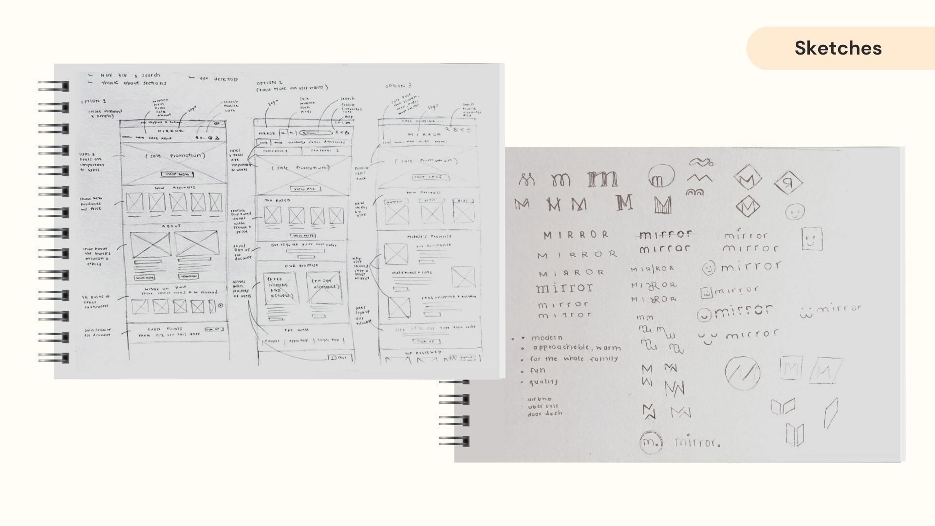
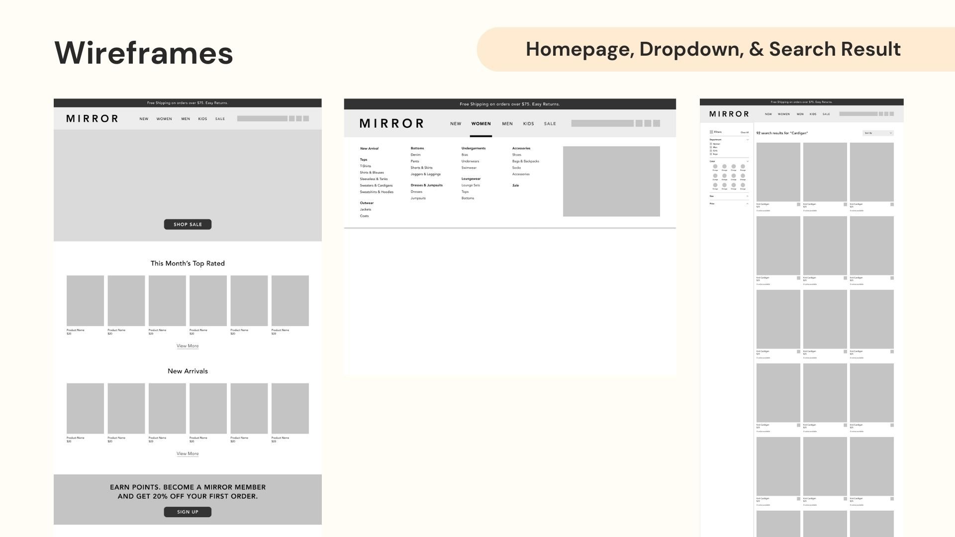
SKETCHES & WIREFRAMES
Once I had identified the required flows, I proceeded to sketch and develop low-fidelity wireframes.


Branding & UI Kit

Testing 🧪
USER TESTING
Test Objectives:
Test if the user can easily navigate the shopping experience, including:
Browsing, searching, and filtering products.
Finding ways that will justify the user’s purchasing decision (such as reading customer reviews and getting guidance and info on size, fit, quality, and materials)
Being able to find their way to customer support.
Finding guidance on returns and shipping.
Testing Goals:
Recognize patterns to:
Understand how participants navigate the website
Know what participants’ general feelings and thoughts are toward the site
Identify if users were able to complete tasks easily
Identify any pain points during the shopping process
PROTOTYPE
I created a prototype to evaluate the ability of participants to accomplish tasks, which includes adding an item to their cart and completing the checkout process successfully:

AFFINITY MAP
After conducting user testing testings, I collected the results and mapped it onto an affinity map to help me determine what iterations to make.

Delivery 👗
THE SOLUTION
A responsive website that helps existing and new Mirror customers easily browse, search, and purchase clothing online.
FINAL DESIGNS


NEXT STEPS
Test KPIs for:
• The number of purchases made via the Mirror website compared to other online platforms.
• The growth rate of Mirror's online user base.
• Analyzing cart abandonment to ensure users are able to checkout smoothly and efficiently.